Restyling editorial strategy becomes a necessity over time, it is a major creative challenge, and the most effective case studies are data-driven. If you only have time to read one paragraph I recommend "Data-driven creative strategy.

Restyling! Ok…?
When it comes to restyling a good deal of the time the logotype, corporate image or the brand as a whole are considered. A restyling action, however, may not only affect the image the brand conveys of itself, but be dedicated to the content it stands for.
In the specific case we are going to lean on, that of Alì Supermarkets, the restyling affected the editorial strategy on the social channels: not only the most obvious aspect of the visual style, but also themes and ways of interacting with the community, that is, formats and topics.
The challenge in these cases is not only creative, but also strategic. It requires powerful ideas along with a deep understanding of the brand and its community, the sensitivity to evolve without changing identity, to update while remaining recognizable.
Why does a redesign become a necessity?
Updating content and visual language becomes an imperative necessity over time. Regardless of whether you take the perspective of the brand or the supporting agency, why make the effort to regularly question what you are doing? First, to stay relevant: not to bore or fall into obsolescence, to show that you are connected to the present time; concretely: to respond to what people are looking for, today. In addition to these intangible values, restyling takes place concretely for performance: all strategies are perfectible, and the "perfect" ones are not eternal anyway.
The community, channels, historical, technological, and market context change. Above all, the brand itself evolves (if it is doing a good job).
How often should a communication redesign be implemented?
This is very dependent on the industry, posting frequency, and complexity of the content mix, but a reasonable order of magnitude for a B2C brand might be annually, with some running adjustments every couple of quarters. Beyond the frantic need to stay relevant, it is important to consider time windows that provide sufficiently reliable data.
Data-driven creative strategy
INSTAGRAM ≠ FACEBOOK
When we sat down at the table to define Ali Supermarkets' social makeover, we started with a question as simple as it is easy to forget to ask: what content has performed best so far? We took last year's content mix and broke down the number of posts for each category, then assessed each one's KPIs for reach, interactions and engagement rate. We derived a "ranking" of the most effective themes and formats, but also a curious fact: the "rankings" for Facebook and Instagram were very different, almost opposite.
THREE CONCEPTS TO BUILD AROUND
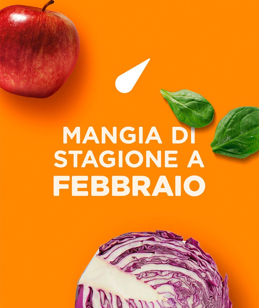
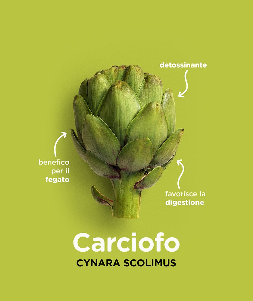
Driving the evolution of the themes were three leading concepts: proximity, food inclusiveness, and family. Translated, it means offering more content of real utility and inspiration, considering the diversity of needs of the consumer audience, providing ideas to help families-the core as well as individual members-in their daily lives.
Formats: video, photos and graphics
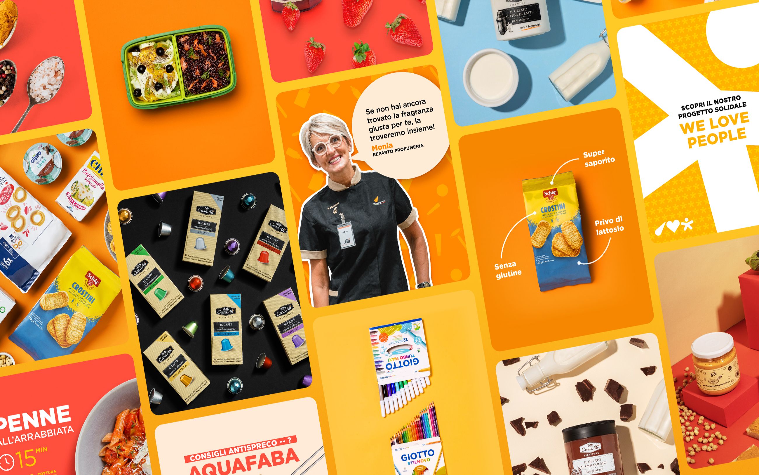
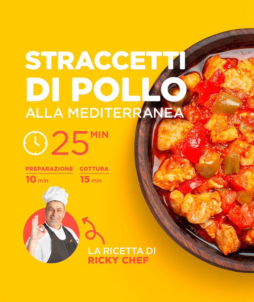
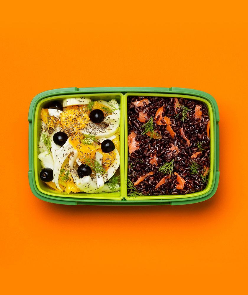
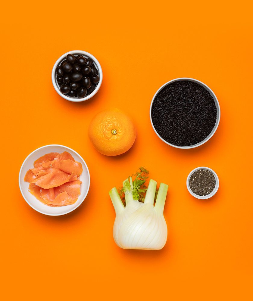
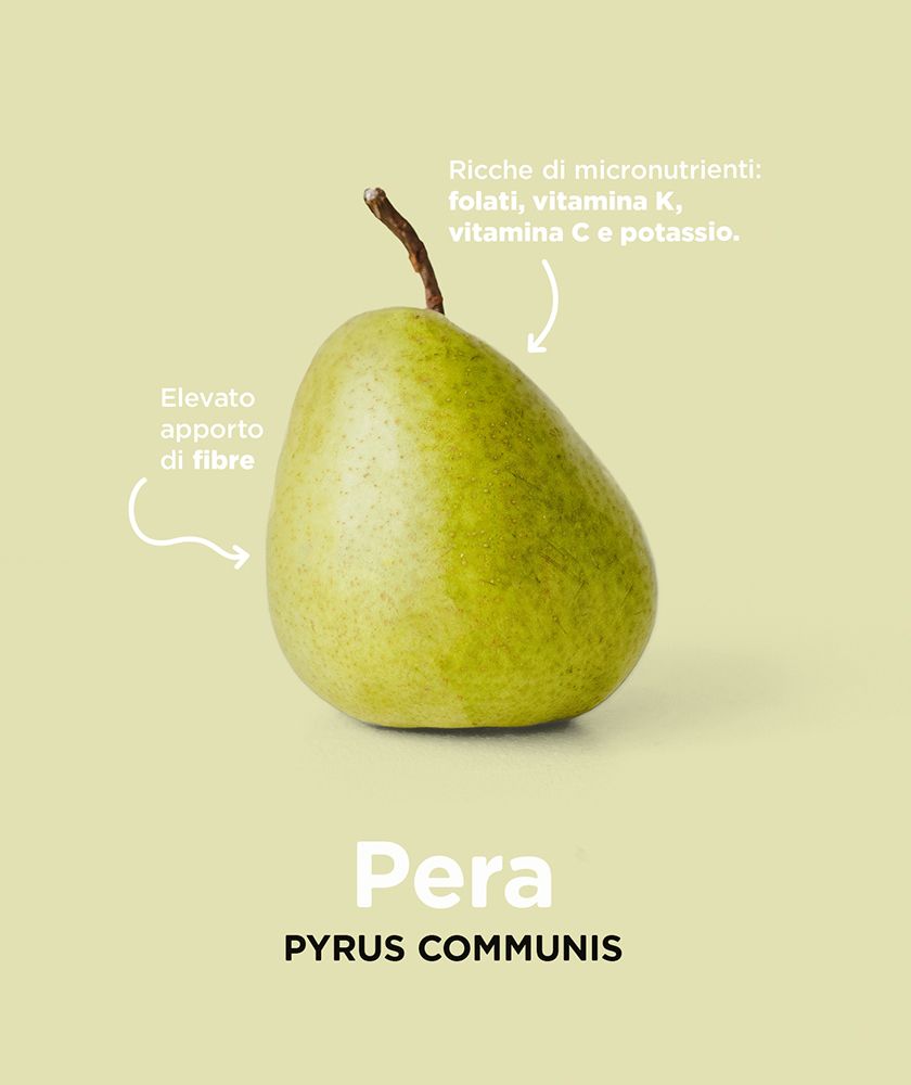
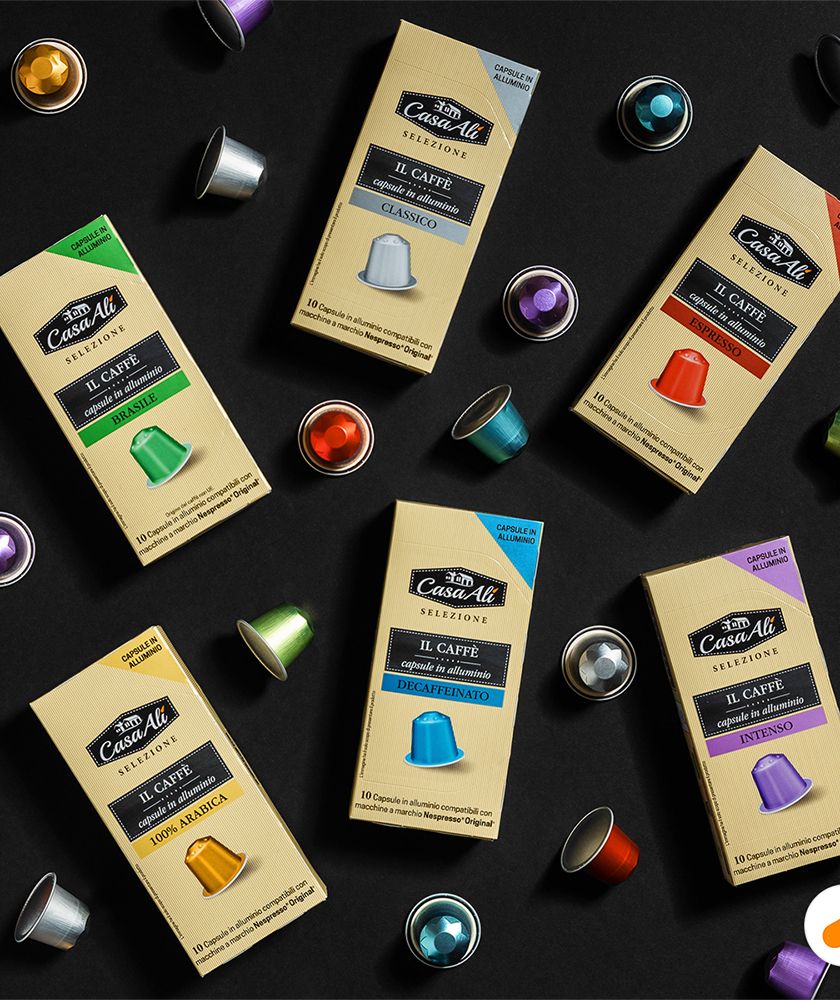
In terms of formats, the needs to enhance the presence of video content, update the style of product still life photography, and make "clean-up" in graphics were identified. We built on these axioms of stop-motion video formats, short-form 2D motion content, montages of longer-form footage for social issues, columns on seasonal offerings, and photo formats to convey useful advice in the home as well as outside the home.
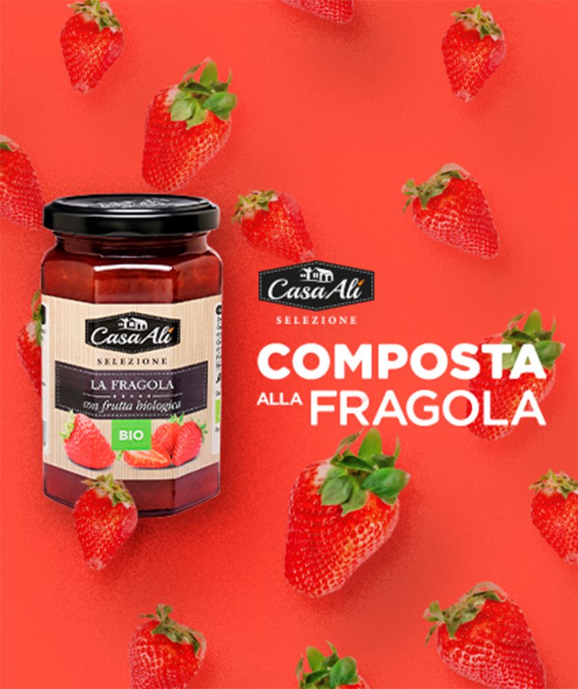
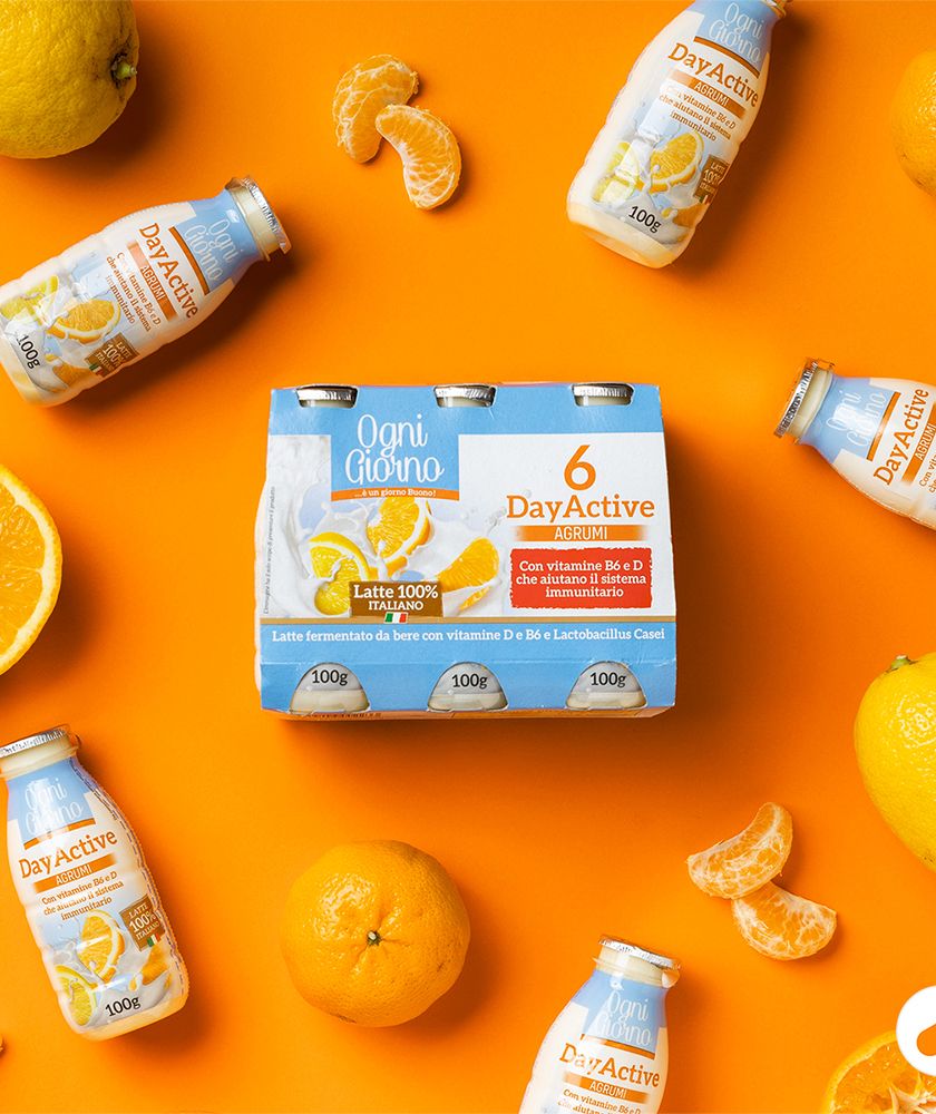
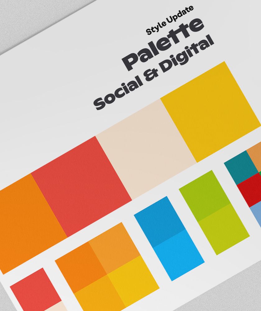
Visual review: less is more
SYNTHESIS AND COLOR
If I had to define two key words that guided the visual style overhaul, I would say they are "synthesis" and "color." The result of synthesis and rigorous use of color is "impact." Those in the industry will know that in the mass market and particularly in the retail sector, proposing minimalism is quite a courageous operation, but in this we believed and looking at Alì's social profiles today the results are clear.
A revamped palette
In terms of formats, the needs to enhance the presence of video content, update the style of product still life photography, and make "clean-up" in graphics were identified. We built on these axioms of stop-motion video formats, short-form 2D motion content, montages of longer-form footage for social issues, columns on seasonal offerings, and photo formats to convey useful advice in the home as well as outside the home.
We did not introduce the changes overnight; we are doing it incrementally. The best redesigns are perhaps those that are perceived without realizing it. Can you see the difference?