
How can a brand communicate the elements of visual identity in a combined and coordinated way to best express its visual potential?

Transforming the customer experience... with an ice cube?
A single ice cube can help create a positive and responsible experience. This is the vision of Premium Italia, an innovative company in the food ice production sector that wants to transform the customer experience for consumers with its Ghiaccio Facile product line.
From content creation to digital design, the team's shared objective was to evolve Ghiaccio Facile's visual identity to make it transversal to all touch points and to bring the brand closer to people. A challenging objective? Yes, but definitely attainable.
Is a universal visual language really possible?
In these years spent between visual design and industrial design, I have learnt that, to achieve this, synergy must be the accelerating factor in the working method.
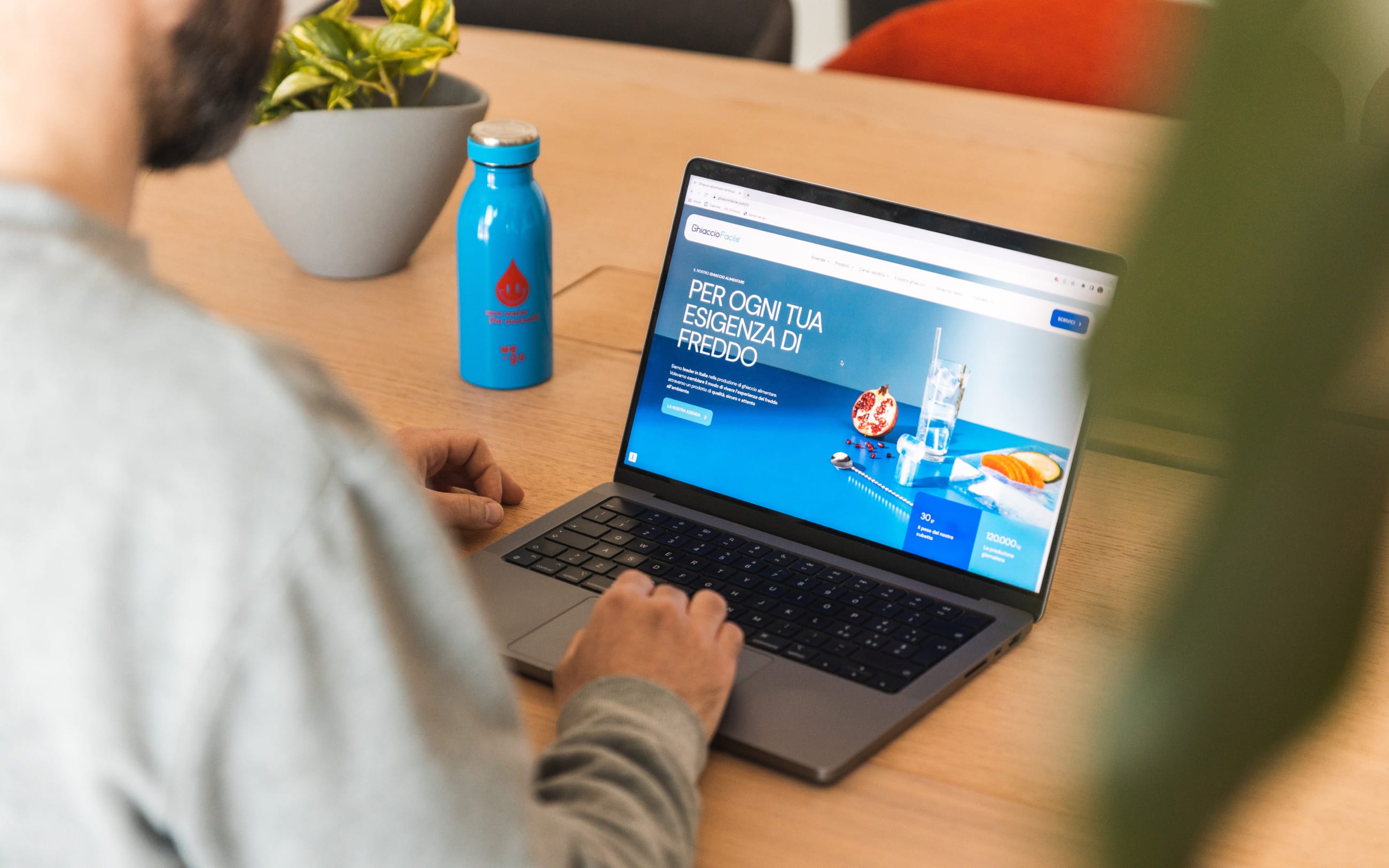
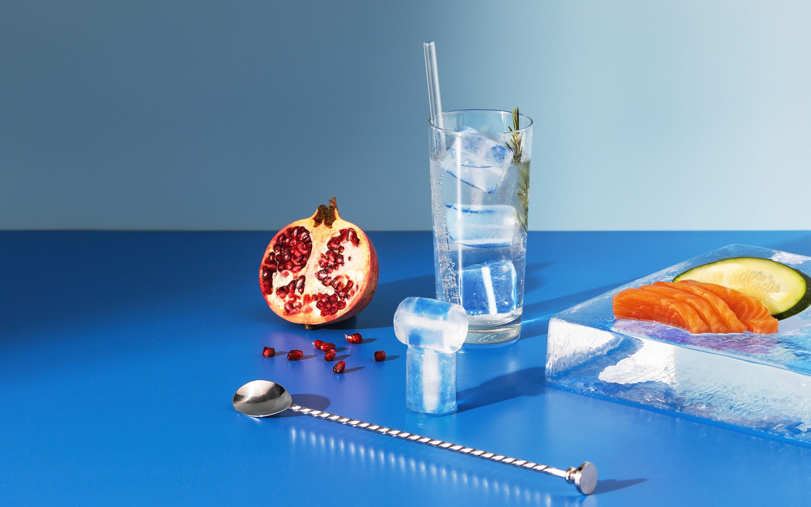
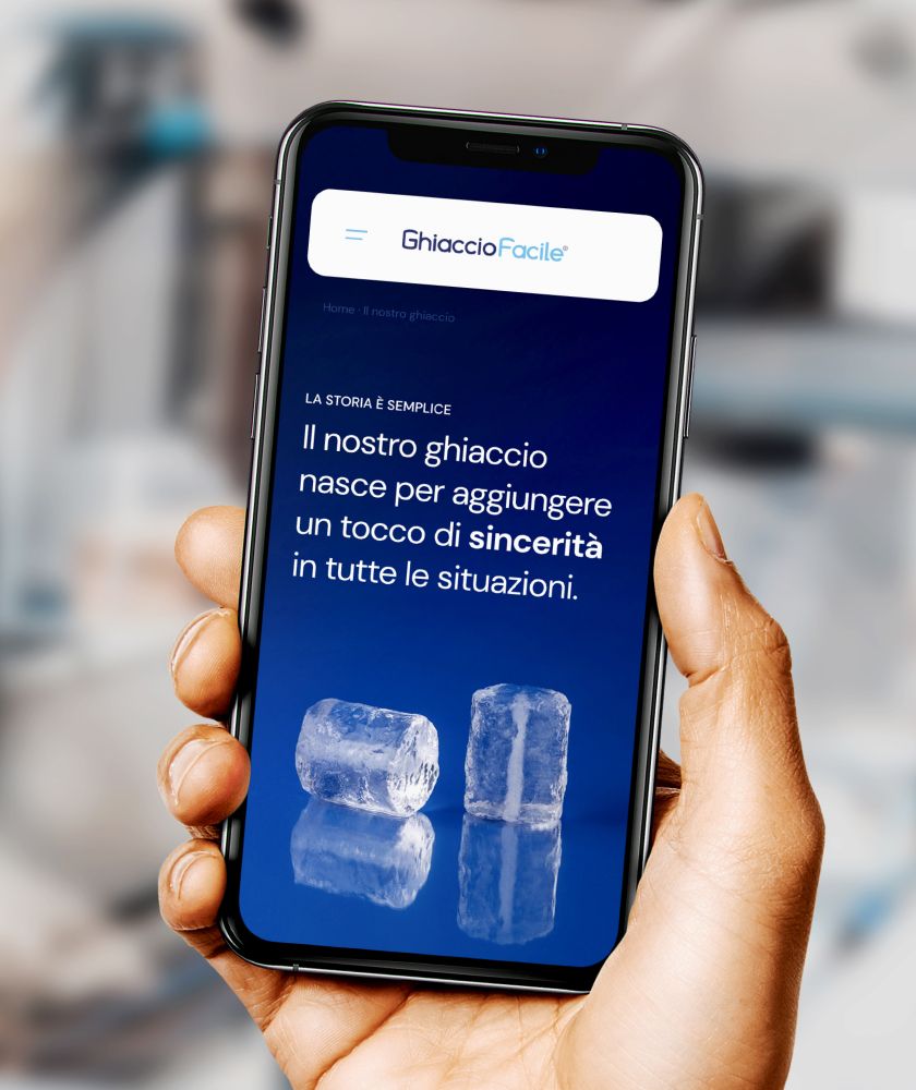
What may appear to be 'just a photo', in our eyes is actually an asset that must meet a plurality of requirements. For the photographic production of Ghiaccio Facile, which involved us in the studio and in the company's production line, we chose a colour palette that would enhance the transparency of the product, creating compositions that were both elegant and UX oriented.
Thus the path that led from concept to go-to-market soon became an agile succession of decisions whose outcomes responded to an overall vision shared with the customer.
Image is not enough if not accompanied by the right tone of voice.
The tone of voice is the style of the dialogue a company engages in with its audience, what - in parallel with the visual identity - characterizes brand communication.
From the redefinition of the company's communication tools - such as mission and vision - to the design of the texts for social posting, for Ghiaccio Facile we chose to speak in a genuine and friendly way, to convey the right perception of the brand to the user.
We chose to characterize the communication in the social channels with a more ironic, fresh and 'pop' approach, to address the community in a contemporary way and increase its engagement.
How to transfer the characteristics of the product into digital design?
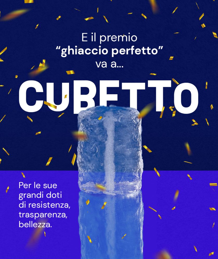
I think the most important challenge in this project was to be able to faithfully interpret the physical and symbolic properties of the product: for Ghiaccio Facile, purity and perfection of form are synonymous with high product quality and process efficiency.
The elements of the user interface of the website trace this concept, taking up the rounded shapes of the ice cube and creating plays of transparency which, together with the content production work, contributed to a user experience tailor-made for the client.
The role of language in brand awareness
Strengthened by the synergy of its constituent elements, the new language of Ghiaccio Facile has repositioned brand awareness and enabled the brand to acquire greater strength also in the proposition of new partnerships.