The brand identity design experience with Alveis shows us the steps to show the brand identity in visual form.

Think what would happen if one day colours, shapes, words and sounds disappeared from the world: wouldn't your ideas be very similar to those of others? Or, worse still, wouldn't all that would remain would be ideas and nothing else? If I thought of a house, with these assumptions, there would be no colours on the walls, the sounds in the kitchen would not be heard and, probably, this house would not even have a shape. In short, it could probably never exist, not even in a drawing.
Brand identity is the colour, shape, words and sounds of a brand: it makes it possible for it to exist and be recognisable, for it to have a unique personality and for its traits to be distinctive and representative of its essence.
Resonate in people's minds
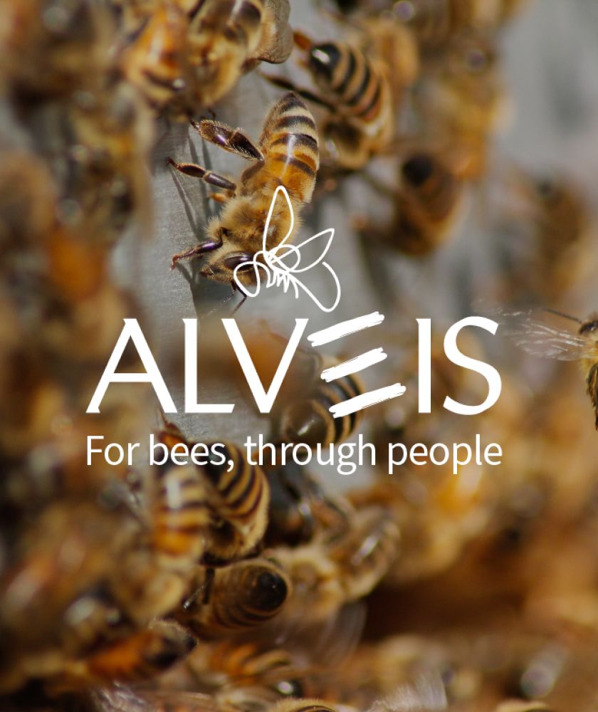
Brand identity is the logo, the payoff, the images, the texture, the pattern, the words it chooses, the icons, the fonts. They are all the visible (and audible, ed.) elements of a brand, which identify it precisely in the consumer's mind and distinguish it from others. Building a brand identity is an act of courage: it means sitting down, becoming aware of who we are, what represents us and where we want to go. It means coming to terms with our shadow sides and deciding concretely how we want to show ourselves to the world. This is what Alveis has chosen to do with us.
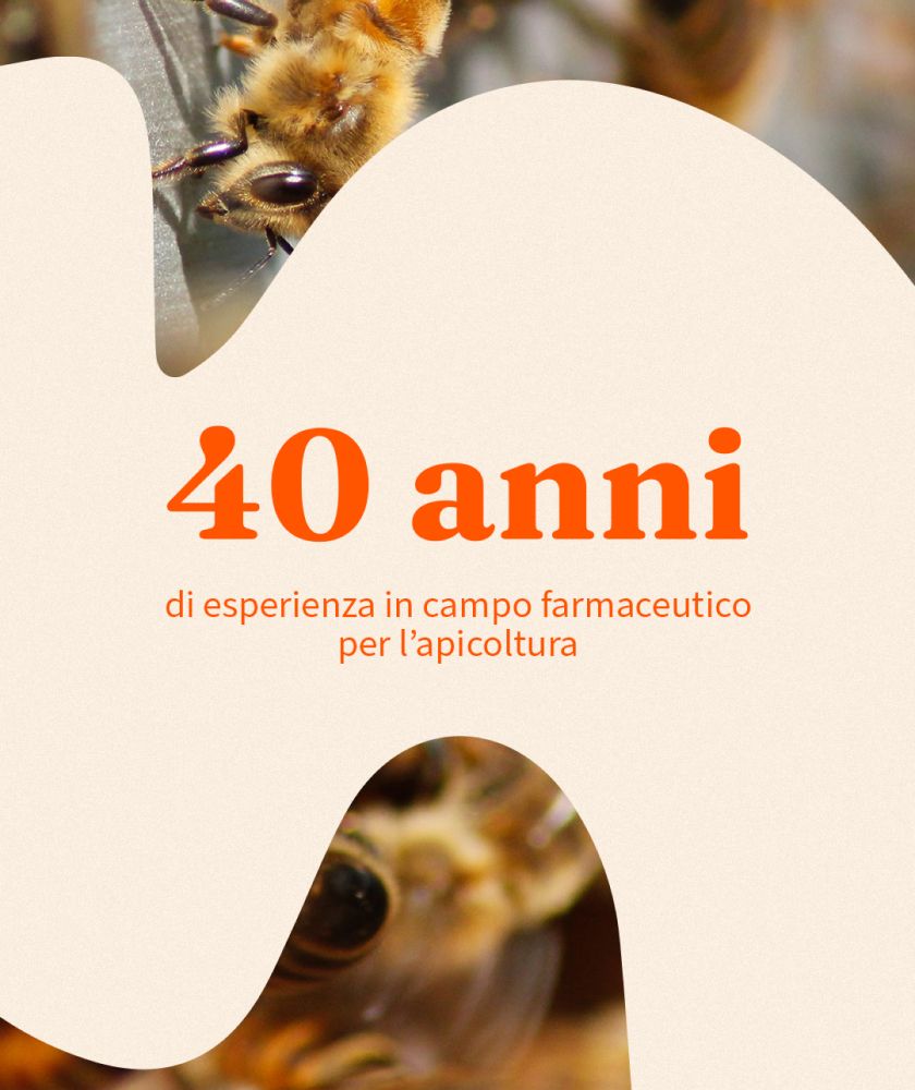
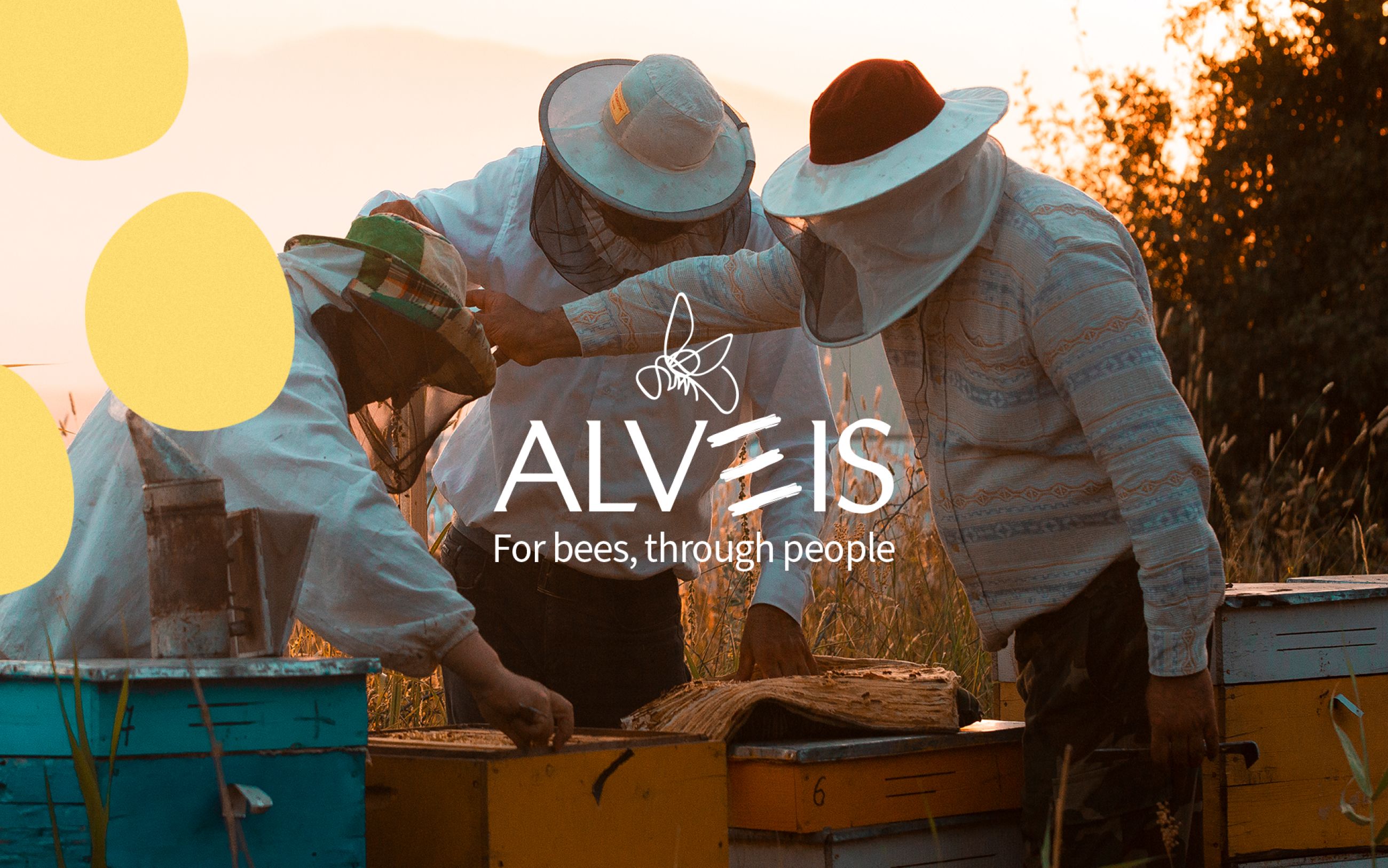
Part of a major Italian chemical-pharmaceutical company, it is a frontline producer of products for the care and nutrition of bees.
We knew it was going to be a special project.
One day, the Alveis team bravely chose to put everything on the table, its colours, its words, its spaces, and showed us its true identity. We met a prepared brand, genuine people and products that take care of one of nature's smallest diamonds, the bees. We couldn't help but feel proud of the collaboration and went on to explore brand identity together.
It all starts with listening
"We stand by the beekeepers. It is essential to talk to them and understand what problems need to be solved and what goals need to be achieved. We could not do otherwise'. Alveis is a company that actively participates in the creation and use of what it produces, pays attention to its stakeholders and then guides them towards the best choice. At the heart of their approach is listening, and that was exactly how the design of the new brand identity went - which is always the best way to start any collaboration.
No successful project has ever followed a straight line. As the company listens to and understands beekeepers, collaborating with a view to constant growth and innovation, the path to building the new identity followed the same path.
How to position the brand
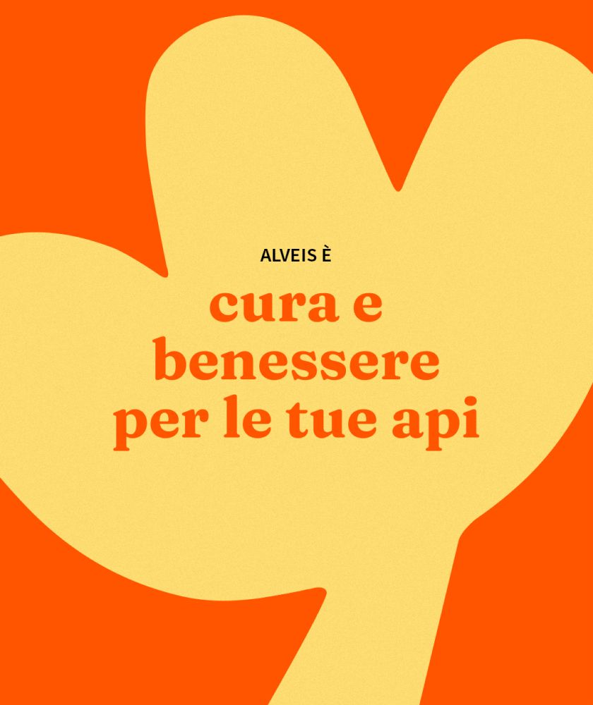
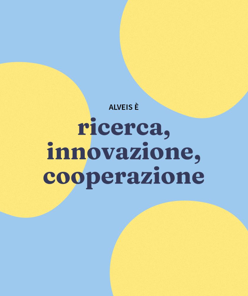
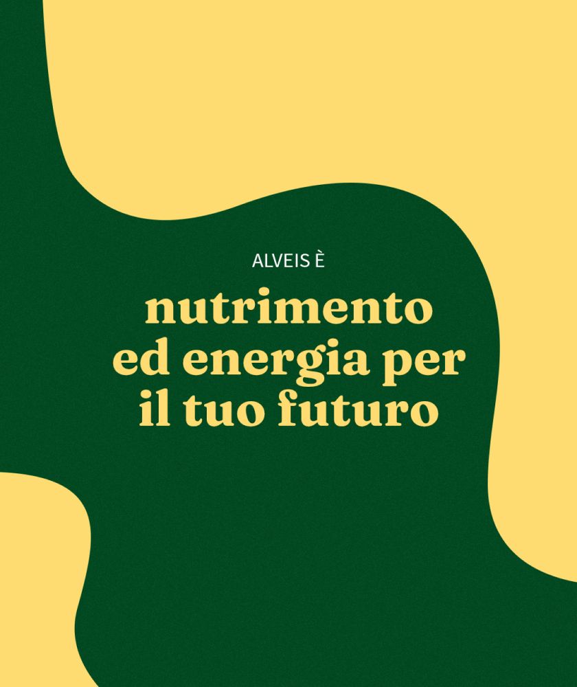
We started with words and came up with four to represent active listening and determine the area of action: For bees, through people. The new Alveis payoff marks the beginning of the path to creating the new brand identity and starts with bees.
Alveis puts itself at the service of nature and animals with its natural, high-performance products. It is as close to nature as it is to people: thanks to cooperation, it succeeds in developing new solutions by weaving a relationship close to beekeepers and people in the field.
Why is the payoff important for brand identity? Because it unequivocally states the placement of the brand.
The importance of visual language
The 'four words' pave the way for the design of the visual elements that represent the company. The elements that revolve around the brand become the protagonists of the visual language, inspiring the choice of a colour palette with vibrant shades that recall the energy of nature.
People, nature and cooperation are the elements that represent the brand and, precisely for this reason, they have been summarised in graphic symbols that give life to the graphic identity of Alveis. And this is where uniqueness comes in: designing the brand identity means starting from the unique essence of the brand and sewing an exclusive and completely tailor-made outfit.
No one will show up at the party wearing the same suit as you, everyone will remember you.
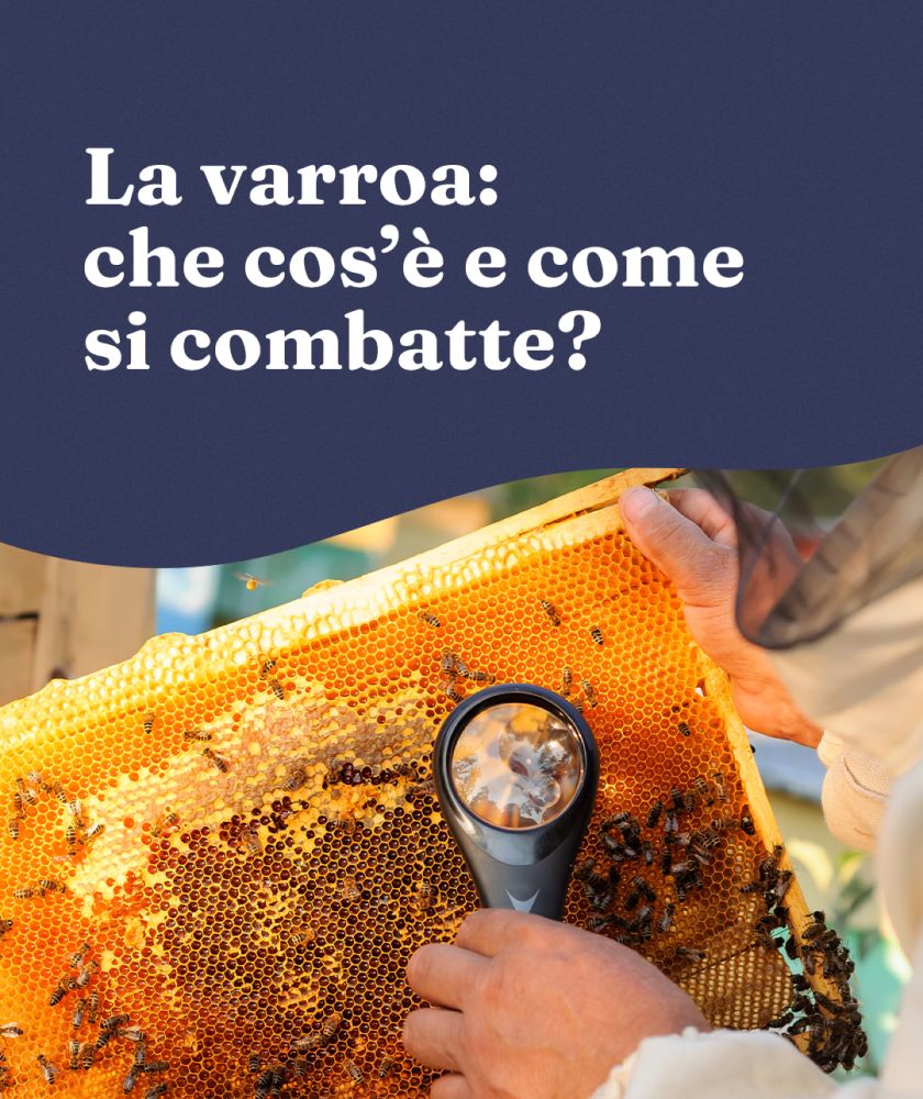
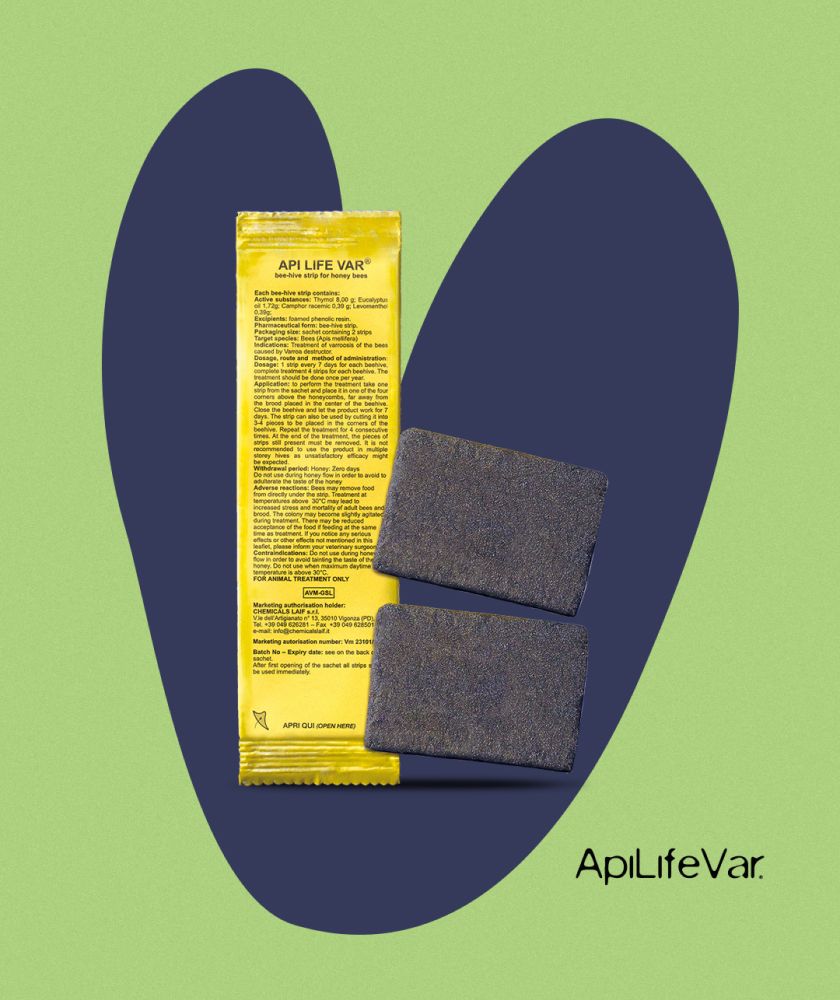
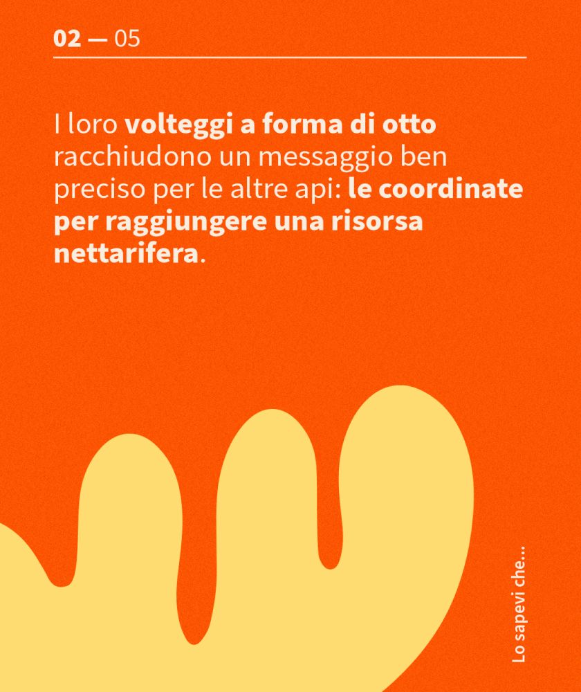
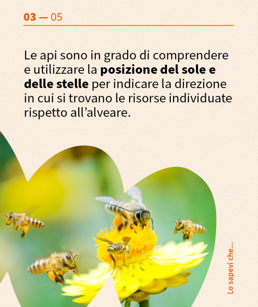
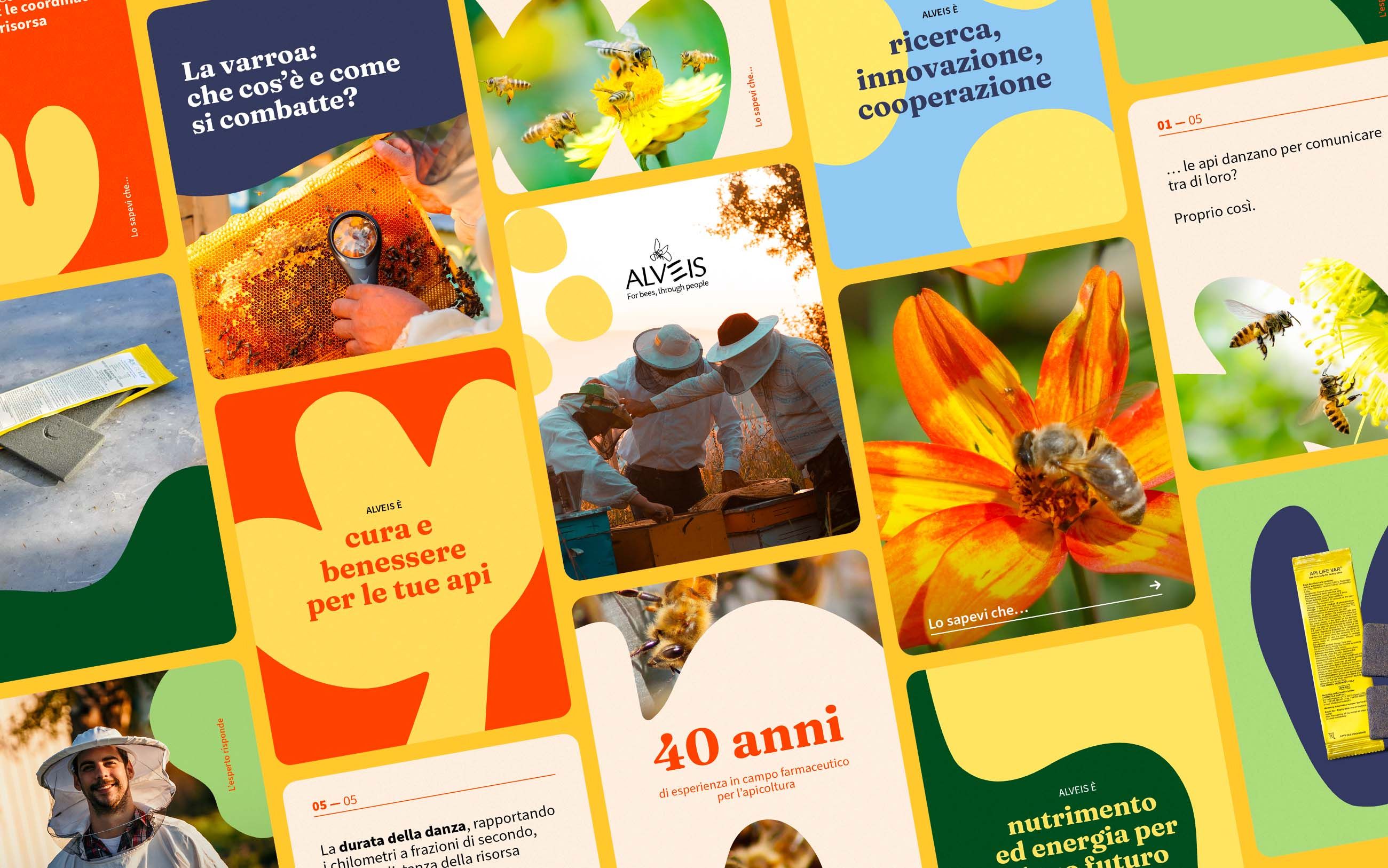
For Alveis, soft shapes reminiscent of nature tell the story of the company in a lively and direct language of the beekeeping world. The new language is used in all the brand's channels, from the catalogue to the corporate identity and social media.
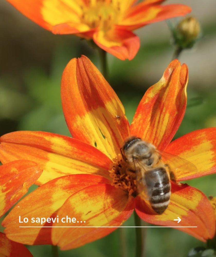
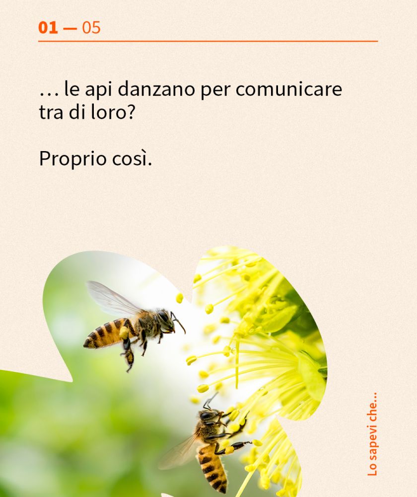
The content strategy that tells a world
For social communication, we devised a content strategy involving beekeepers and hobbyists, creating an environment in which useful and interesting information and content could be exchanged. Once again, cooperation was at the heart of the strategy, taking brand communication outside the 'home' walls.
The visual identity, combined with the content strategy, became an extension of Alveis' passion and care for such a delicate, yet powerful world as bees.